


Building the loma studio a Brand.
THE CHALLENGE
Business Goal: To create a brand identity for a new design studio (Loma Studio) that would attract a specific target audience: entrepreneurs and service-based businesses in need of strategic design.
Brand Challenge: The brand needed to stand out in a crowded market of design studios. It had to communicate a unique philosophy—one that balanced modern, minimal aesthetics with a deep focus on functionality and measurable, real-world results.
Positioning Challenge: The identity had to clearly position the studio as a provider of both high-end, bespoke consulting services and accessible, high-quality digital products (templates), without either one undermining the other.
THE STRATEGIC APPROACH
My Core Strategy: I developed a brand identity centered on the principle of "graceful minimalism." The strategy was to create a visual and verbal system that was clean, modern, and sophisticated, but also warm and approachable.
Why this was the right approach: This approach directly reflects the studio's core value proposition. The minimalism speaks to clarity and focus, while the "graceful" element communicates the high-quality, thoughtful execution. This duality was essential to appeal to an audience that values both beauty and business results.
The Creative Execution: The brand system uses a clean, modern logotype, a refined color palette, and elegant typography. Every element was intentionally chosen to prioritize clarity and usability, from the website UI to the product mockups, ensuring the brand's own design supported its core promise of "design that functions with purpose."
THE OUTCOME
The Qualitative Result: The result is a cohesive and compelling brand identity that successfully communicates Loma Studio's unique position in the market. The brand feels both premium and accessible, attracting the ideal client base.
The Business Impact: The strong brand foundation has enabled the successful launch of a growing collection of digital products on Etsy and has served as a powerful magnet for attracting bespoke brand strategy clients. The brand itself has become a key business asset, demonstrating the power of a strategy-first design approach.

The loma studio Mark
Typography in the loma system supports structure, hierarchy, and tone — blending modern clarity with human warmth.

Wordmark

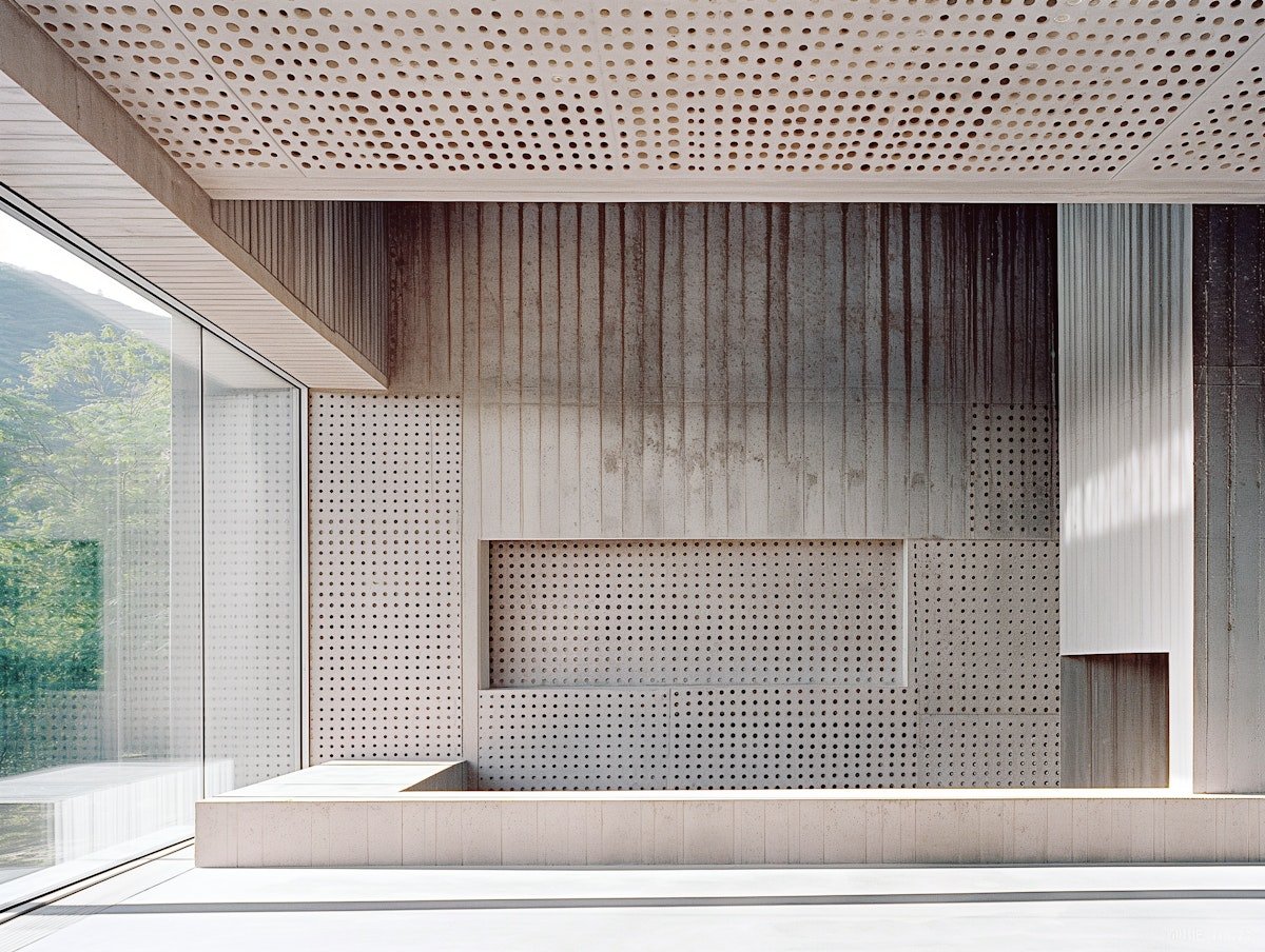
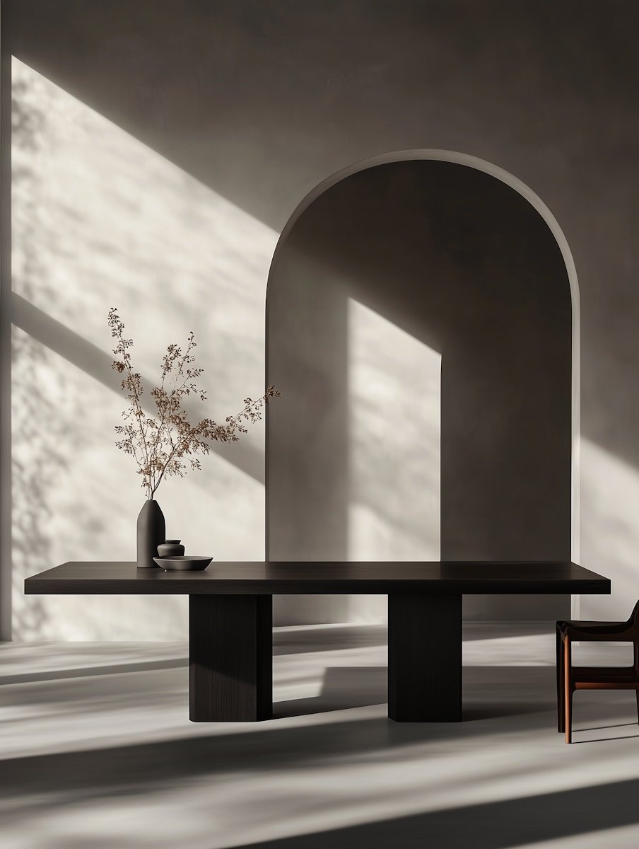
Visual Foundations
The design system behind loma studio is built on clarity, calm energy, and structured adaptability — supporting both templated products and private client projects with a consistent, modern visual language.
Mood Board


A Grounded, Flexible Color Palette
Studio Colors
loma studio’s color palette is designed for clarity and flexibility across both digital and print formats. Its core tones — Black and White Linen — create a neutral foundation that lets the design itself take center stage.
Supporting colors act like siblings: distinct, purposeful, and used selectively to elevate structure or narrative. The result is a system that’s visually calm, but ready to adapt.


Typography
The Voice of the Brand
Typography in the loma system supports structure, hierarchy, and tone, blending modern clarity with human warmth.


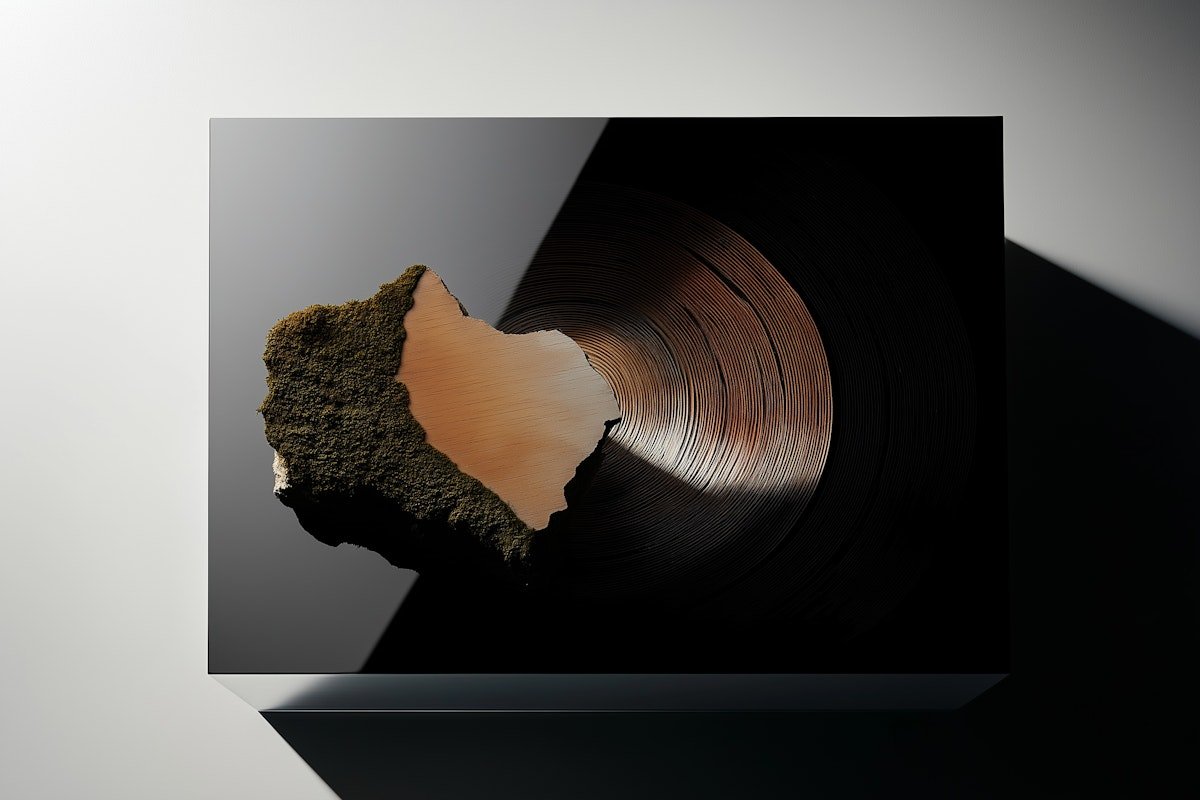
Signature Shapes
Soft, Organic Forms Used to Express Brand Tone and Guide Visual Flow.
The signature shapes used in the loma studio brand serve as ambient visual tools — subtle, organic, and intentionally non-intrusive. Their blurred forms add softness, movement, and tone, supporting layouts without pulling focus from the content.
These elements appear sparingly across templates, backgrounds, and presentation moments, bringing cohesion, warmth, and a sense of calm identity to the brand system.


Digital Brand Expressions
Social in Motion
A selection of branded social assets created to promote loma studio across Instagram; showcasing the brand’s voice, tone, and visual system in motion.

Instagram Story

Tik Tok Cover

Instagram Reel

Brand Book


