

STRATEGY
Planit Capital
Brand repositioning and website redesign for a capital markets firm targeting high-net-worth clientele. Strategy, visual systems, and Figma design infrastructure.

Brand repositioning and website redesign for a capital markets firm targeting high-net-worth clientele. Strategy, visual systems, and Figma design infrastructure.


THE BRIEF
Planit Capital operates at the intersection of institutional relationships and high-stakes capital deployment — bridging businesses with PE firms, family offices, and venture networks. But their existing website didn't reflect any of that. The typography was inconsistent, the layout generic, the copy dense and unreadable. Nothing about the visual experience signaled that this was a firm serious investors would trust.
The brief was clear: reposition the brand visually and architecturally to match the caliber of the clients they serve and the capital they move.
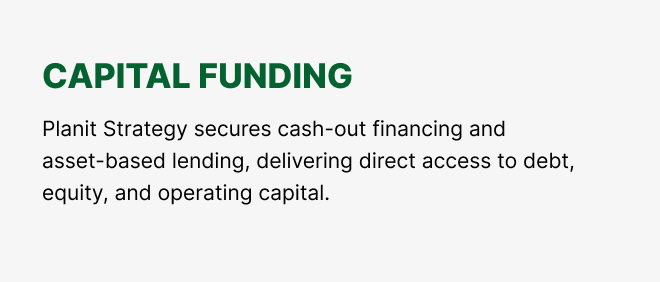
VISUAL STRATEGY
The redesign was built on a single principle: authority earned through restraint. High-income, institutionally-minded audiences don't respond to visual noise — they respond to confidence expressed through precision.
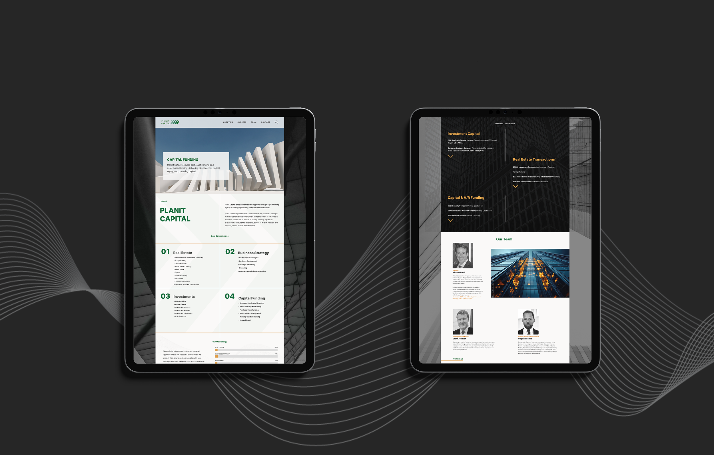
A deep forest green anchors the brand, chosen not just for its association with capital and growth but for its weight. It holds the page rather than competing with it. Photography was shifted to editorial-grade black and white: the Brooklyn Bridge, glass curtain walls, abstract architectural forms. These aren't decorative choices. They signal the world Planit Capital operates in: infrastructure, scale, long-term thinking.
Typography was rationalized across the entire site. All-caps section labels were set with deliberate tracking. Body copy was given breathing room. The hierarchy was made unmistakable at every scroll depth, so a reader skimming for credibility finds it instantly.
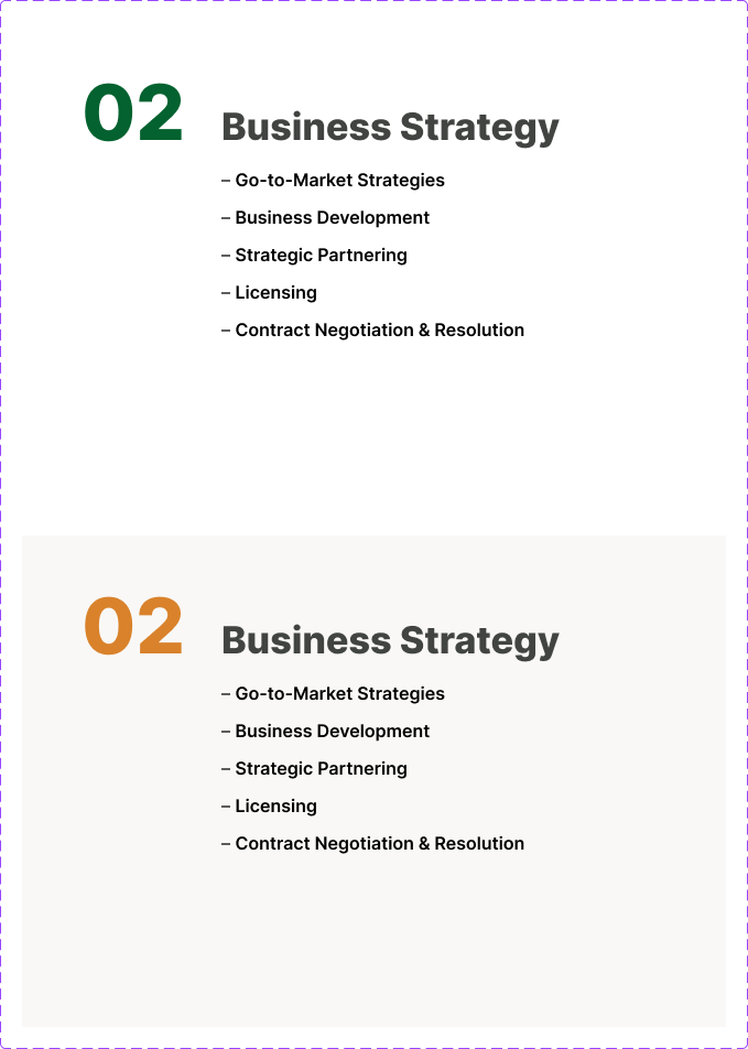
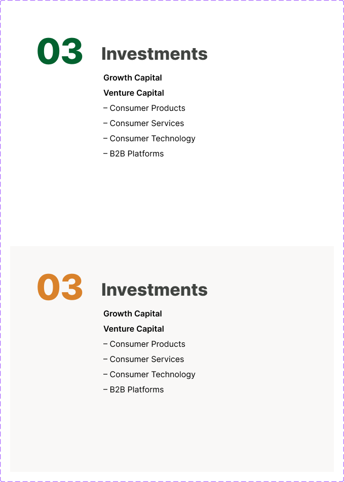
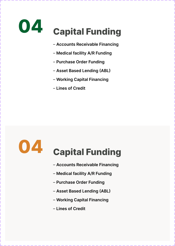
Each competency card was built with a hover state. The color shift on interaction was designed to reward engagement and reinforce the brand palette at the moment a user shows intent.

DESIGN INFRASTRUCTURE
The site was designed as a system, not a series of one-off pages. Each module — the numbered competency cards, the full-bleed service banners, the methodology bars, the contact section — was built in both light and dark variants, so the marketing team could mix contexts without breaking visual logic.
Figma was chosen as the design infrastructure deliberately. In a firm like Planit Capital, design assets need to move across teams: leadership reviews, marketing executes, developers build. Figma makes that chain frictionless. Every component lives in a shared library. Spacing, color, and type styles are defined as variables. When something needs to change. A service offering, a team member, a campaign push. The edit happens once and propagates everywhere.
This isn't just a design handoff. It's a long-term operational asset.


MY APPROACH
Every engagement starts the same way: diagnosis before prescription. Before a single layout is touched or a typeface is chosen, I need to understand what the existing work is communicating and to whom. With Planit Capital, the audit was immediate. The site was built for no one in particular, which meant it wasn't working for anyone specifically.
From there, strategy precedes aesthetics. I work backwards from the audience, their expectations, their sophistication, what earns their trust versus what loses it. For a firm operating in institutional capital markets, the visual language needed to do the same work their team does in a room: signal competence without explaining it.
The last principle is operability. A design that only I can maintain isn't a solution, it's a dependency. Every system I build is handed off with the infrastructure to run without me. That means component libraries, documented variants, and tools the team already knows. The work should outlast the engagement.