


Santander Bank
Santander Private Client Debit Card


Translating brand prestige into a tangible, high-touch experience for high-value clients.
THE CHALLENGE:
Business Goal: As part of the new "Santander Private Client" launch, the bank needed a debit card that would serve as a physical symbol of the program's exclusivity and premium status.
Brand Challenge: The card had to feel distinct and elevated from standard bank cards. It needed to visually and tactilely communicate a sense of prestige, security, and sophistication to a discerning, high-value clientele.
Design Challenge: The design had to be innovative and artistic while still adhering to the strict brand guidelines of a global financial institution and the technical constraints of card production (e.g., chip placement, materials).
THE STRATEGIC APPROACH:
My Core Strategy: My strategy was to create a "lifestyle-inspired" design, moving away from traditional bank aesthetics and toward a look and feel more aligned with luxury goods and high-end technology. The focus was on the interplay of light, movement, and premium finishes.
Why this was the right approach: The target audience for Private Client services is accustomed to a higher level of design in all aspects of their lives. A standard bank card would have undermined the "premium" promise of the entire program. This approach ensured the card itself became a key part of the value proposition.
The Creative Execution: I explored a series of designs that captured a sense of elegance and dynamism. The final designs utilize a multi-layered system with metallic PVC, spot gloss coatings, and intricate line work to create a sense of depth and motion. This light-layering technique enhances the tactile experience and creates a seamless integration of aesthetics and usability, making the card a statement piece, not just a tool.
THE OUTCOME:
The Qualitative Result: The final card designs successfully created a premium, tangible representation of the Santander Private Client brand. The fusion of art and innovative production techniques resulted in a debit card that feels like a luxury object.
The Business Impact: The high-end card design was a critical component in the successful launch of the Private Client program. It reinforced the program's positioning, enhanced the perceived value for new clients, and served as a powerful physical touchpoint that differentiated Santander in the competitive high-net-worth banking market.
Images That Shaped The Design Direction
Overview
When Santander Private Client sought to develop a new credit card that combined innovation, aesthetics, and functionality, I was entrusted with leading the design from concept to completion. This project was an intensive, collaborative effort involving close coordination with Santander’s team and a card production company in the UK. The objective was to create a card that reflected Santander’s premium brand image while appealing to their diverse clientele through eco-friendly, high-durability, and visually striking designs.


Design Process & Mood Board


A Fusion of Art & Innovation: Lifestyle-Inspired Debit Cards
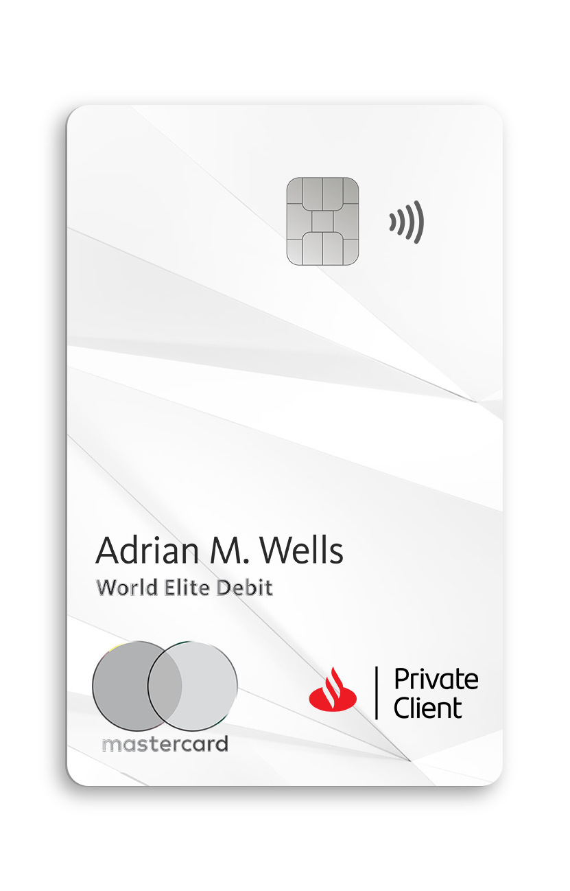
Inspired by the interplay of light, movement, and elegance, these exclusive card designs capture the essence of sophistication and modernity. Each card is crafted with a special iridescent ink, creating a mesmerizing effect that shifts in color as it moves—an embodiment of dynamism and fluidity.
To enhance depth and visual intrigue, the imagery is meticulously layered beneath multiple PVC clear coatings, creating a refined sense of dimension between the artwork and the final printed details. This thoughtful layering not only enhances the tactile experience but also ensures a seamless integration of aesthetics and durability.
The Santander signature red accents, when present, are treated with a semi-gloss or high-gloss coating, amplifying contrast and reinforcing the brand’s iconic presence. Every detail—every reflection—invites an experience that goes beyond function, making this more than just a card, but a statement of exclusivity.


A Card That Commands Presence: The Metal Card
Designed for those who value substance and prestige, this metal card delivers a truly elevated experience. Crafted with a refined textured surface, it not only carries a distinctive weight but also enhances the user experience, offering a tactile richness that makes every interaction feel exceptional.
The Santander Private Client branding and typography are laser-etched onto the metal, creating a seamless fusion of precision and sophistication. This meticulous detailing ensures that each card is as visually striking as it is durable.
More than just a payment method, this card is a symbol of status—a reflection of both craftsmanship and exclusivity.


A Card Purpose:
Eco-Friendly Debit Cards
Sustainability meets sophistication in this eco-friendly collection, designed for those who seek both luxury and responsibility. Made from 100% recycled materials and eco-conscious inks, these cards maintain the premium experience while reducing environmental impact.
Each card is printed with a special iridescent ink, creating a dynamic color shift that enhances both aesthetics and user experience. As with previous designs, the imagery is carefully layered beneath multiple PVC clear coatings, adding depth and dimension.
To further refine the look, the Santander red accents are treated with semi-gloss or high-gloss coatings, ensuring a premium feel while staying true to sustainable innovation.
This card is a testament to designing with purpose—blending exclusivity, innovation, and eco-conscious craftsmanship.


Runners-Up and Final Credit Card Designs

A Card Designed for Versatility: The Motion Collection
Inspired by the rhythm of the city, The Motion Collection captures the fluidity of urban movement, where skyscrapers, shifting perspectives, and bold lines create a dynamic flow.
Laser-printed patterns add a subtle 3D effect, enhancing both visual depth and tactile experience. Built with three distinct printed layers and sealed with protective PVC coatings, the design ensures both durability and elegance.
For a refined finish, the Santander branding and typography are embossed, seamlessly blending with the structured textures.
More than just a card, it’s a statement of motion, structure, and sophistication.

Runner Up Motion Collection


